 I’ve been pondering for a while on how to showcase some replay functionality in our AMPS product in a way that’s general enough that everyone understands the concept, yet provides a solution metaphor that easily translates into other domains. Ideally, the data would be from some real-world system, where time-series, ordering, and content filtering could be useful (again, leveraging the features of the product I’m trying to explain.)
One thing is for certain: whether you’re building a demo for your product or just trying to practice skills in big data, YOU NEED DATA. While Fisher’s Iris data set from the 1930’s is great for text book explanations of clustering, k-means, and some machine learning concepts, it doesn’t really exercise the cutting edge technologies that are designed for today’s large scale problem domains.
Earlier this month, I came across one of the most fascinating datasets I’ve seen to date: The NBA Motion Tracking database. Since the 2013-2014 season, every NBA court has 6 cameras elevated above the playing field that samples the 10 players and ball (in 3 DIMENSIONS!) at 25 times per second. That’s HUGE! You have a list of distinct players, teams, shot locations, all packaged into a beautiful time series accessible data set. All game events combined are around 6 BILLION events from 2013 through 2015, including the standard games, playoffs, and all-star games. The ball metrics include the x, y, and radius, which tracks the ball in all 3 dimensions throughout the game.
Without a doubt, knowing that the NBA is tracking all of this data and making it accessible [1] has made BASKETBALL MY FAVORITE SPORT (sorry, Soccer!)
Why would the NBA be doing this? Just look at the stats on http://stats.nba.com, which track certain player performance metrics: speed, shot percentages, court coverage, etc. With this data, team owners could even do their own data science projects determining the rate at which certain players fatigue, becoming less effective. Or, imagine A/B testing combinations of players on your team to find the best lineup for the playoff games.
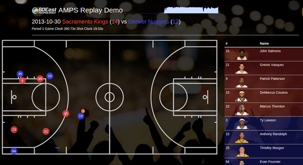
For my purpose, I just downloaded a subset of the data and assembled a visualization where I used AMPS for high performance replay of the messages to my browser using the AMPS Javascript client API and then ran visualizations through D3.js. Given that the data is tracking physical objects over time, it makes for a fun visualization that requires little explanation. If you want to check it out, it’s here: http://replay.demo.crankuptheamps.com.
Bottom Line: If you’re searching for cool data to explore data science and/or visualization techniques, you should totally swing on over to http://stats.nba.com and take a gander – it’s so much fun. Don’t let the lack of documentation discourage you, there are some great resources available as people are making use of this dataset. Below are some resources to get you started[2] if you’re new to this.
Plug: If you’re interested in the fastest message replay engine (which happens to support pub/sub, message queueing, SQL queries, historical queries, content filtering, aggregation and conflation… and so much MORE), then please check out AMPS at http://www.crankuptheamps.com.
Thanks!
[1] “accessible” is used loosely here, since I couldn’t find any public API’s or documentation on what the data contained. Luckily, it’s large JSON objects, and they’re used from most of the pages on stats.nba.com, making it easy to understand what the data contains.
[2] How to scrape the NBA data: http://www.gregreda.com/2015/02/15/web-scraping-finding-the-api/
[3] For info on how to build (and get inspired by others!) visualizations, check out the d3js.org gallery.